EDITORIAL | The Illustrating Man: Refining Spot Art for Planet Scumm
by Sam Rheaume, Planet Scumm in-house Illustrator
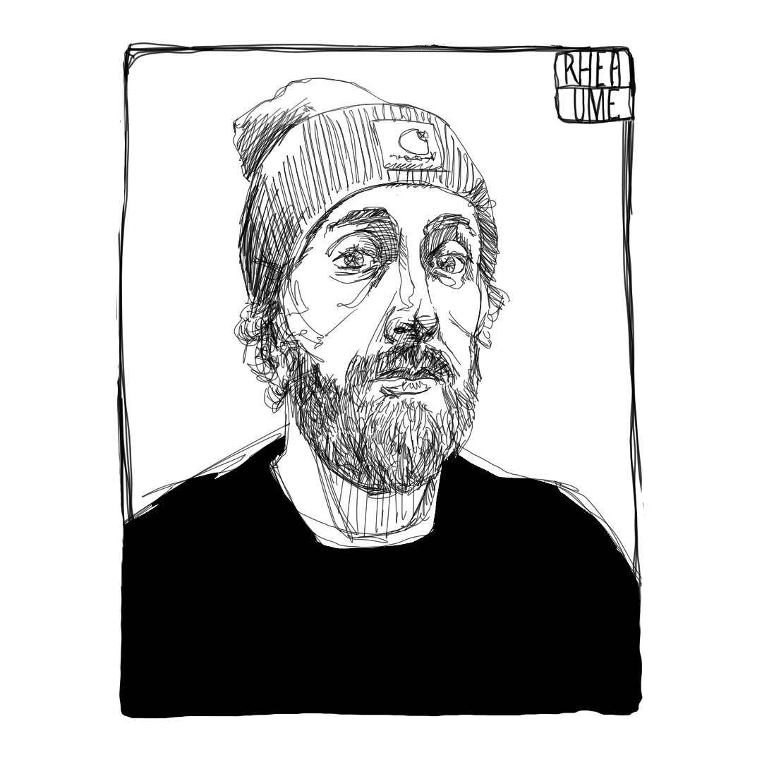
Spot illustration from Planet Scumm Issue #8
In the beginning, Scummy asked me to drop everything and change the way I had always approached my artwork. Now, because I am a totally slave to the Scumm, I’ve been asked to employ my average writing skills about how I went from being a mediocre illustrator to a slightly-less-than-mediocre illustrator. Since I love you, our presumed reader, and since Scummy is endlessly hungry for content, let’s give this a whirl.
***
It was the summer of 2017 when some old friends approached me about coming onboard a venture into the world of Sci-Fi publishing. It was a new zine, smartly named, and aspiring to make a dent in the transnational zine scene, a world that blended our collective interests in literature, art, pulp, comics, and DIY team projects.
While we got our collective act together around the how and why of becoming independent publishers in a market saturated with lots of voices and a seeming lack of ears, I was making a personal shift in my own process as an illustrator. This evolution has challenged my process and taught me a crucial skill that will probably go on to be my greatest asset in my creative career: how to forget what I’ve learned.
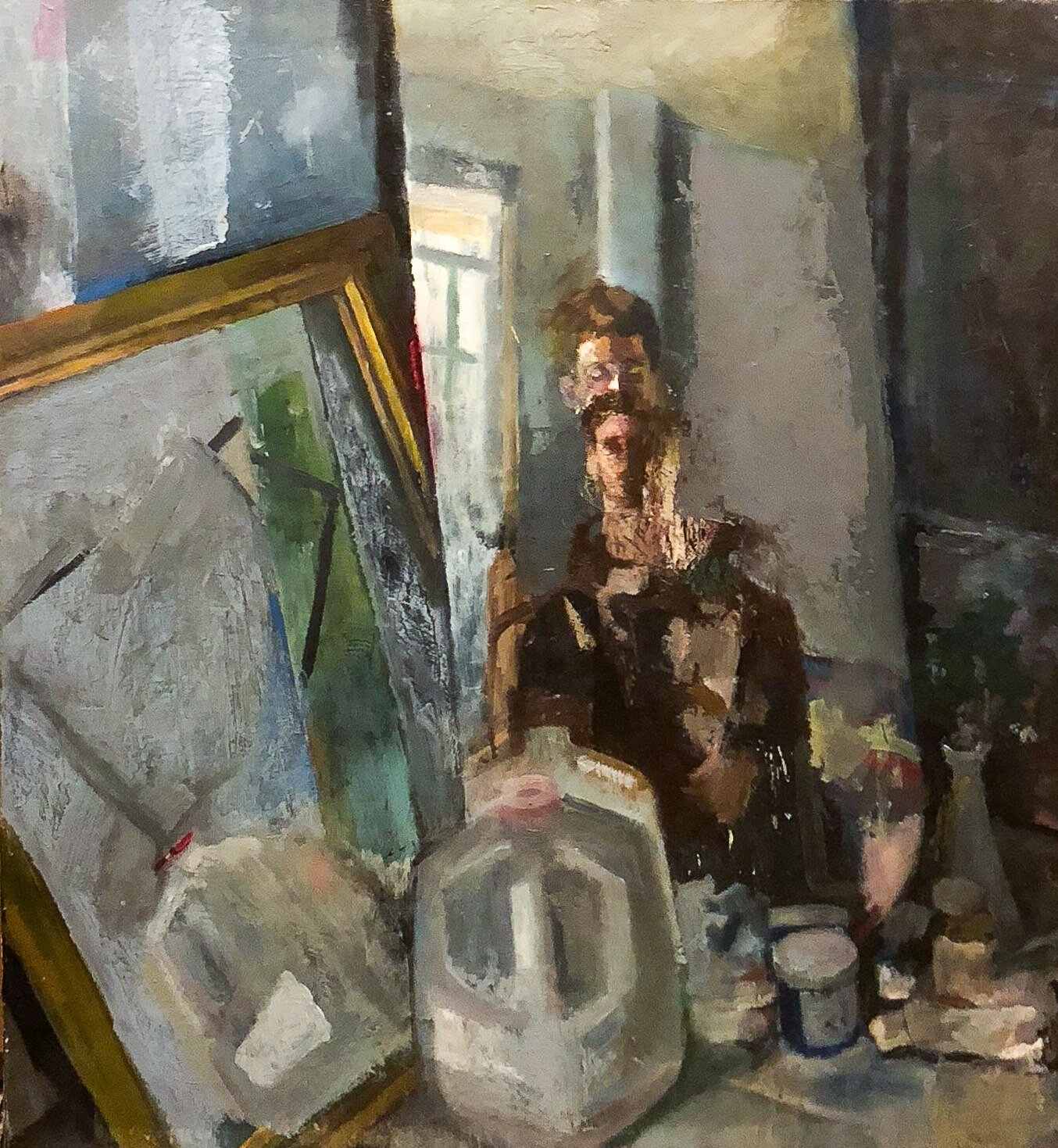
You see, I was a painter. A decent painter, an expressive painter. A painter who’d rather paint people’s houses than sell out to the graphic arts. At least, that was part of what was drilled into me for the duration of my academic career. However, I’d been nursing a love for comics, illustration, and the marriage between word and image for a while as though they were fetishes. The time had come to let my freak flag flow across the page in sci-fi glory.
The only problem? I had almost no idea what I was doing.
How Planet Scumm Kicked My Ass
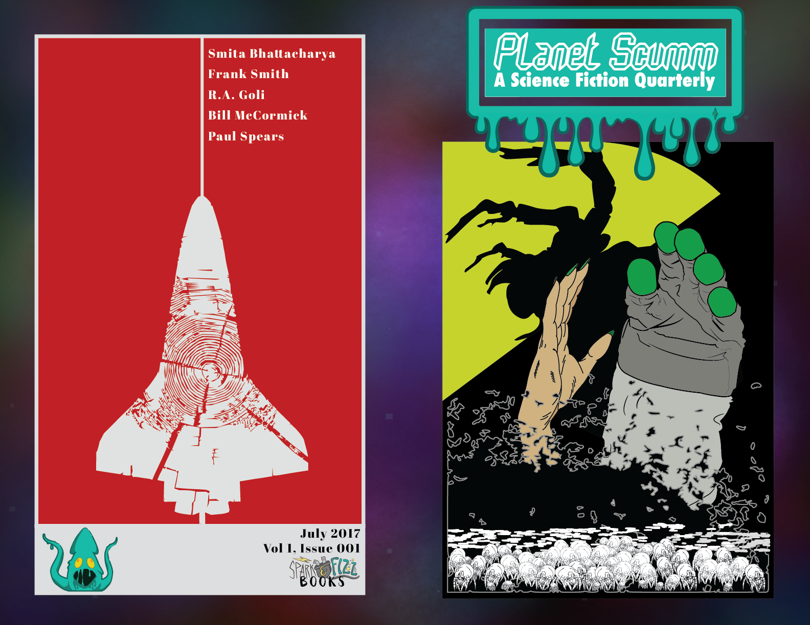
The first image I made for this old rag was the cover of Issue #1. I remember at the time I was teaching myself to use the Adobe Creative Suite. No courses, no previous experience, just Youtube and making a lot of really, really ugly designs.
So I sort of vowed to myself that I’d do the job in Illustrator—knowing absolutely nothing about the program. It was the beginners’ foolishness and, despite my current attitude toward the resultant cover, I don’t regret a thing.
It was a painful process, though. I remember painstakingly putting each element together. I had no Wacom tablet, so I articulated every bezier curve individually with a million little mouse clicks. The hand-rendered mite, designed to print at a mere 5mm in height, took me two hours to complete. It was a brutally inefficient process.
As a matter of fact, the whole ordeal compounded my usual artistic hopelessness. This is an emotional state known to every creative—the moment where you’ve gone headlong into a project, poured a lot of time and love into the composition, but it’s not working the way you’d hoped. It all looks a mess, it feels unsharable, and there seems to be nothing that can be done to stave off the inevitable sinking of the ship.
Well, when you’ve signed on to a project with your friends, when authors need to get paid, and there’s something actually riding on you completing the image, the fire has no choice but to be stoked. After a “yeeeaaah, we need it now” from Tyler, I spent the entirety of an evening, from around 6pm to 3am, finishing the cover and watching Youtube tutorials, trying to figure out how to achieve something that I would have been able to do in seconds with traditional media.
Do I want you all to see the image? I’d prefer never to have to look at it again myself. Will one of my lovely colleagues dig up the image for this article? Outlook not so good.


Rockets (Usually) Only Go Up
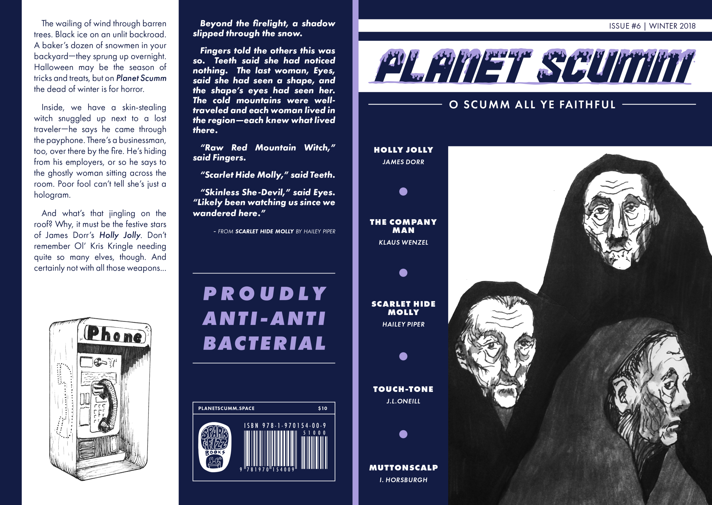
Queue the spots. Starting in Issue #4, I began to moonlight as Planet Scumm’s half-emotionally-available spot illustrator. In many ways, beginning to do these small, monochromatic illustrations was much more aligned with the way I had been making art in the past—my interest in formalism and line art was going to have its moment.
My sorry amateur self, equipped with only a pen and a sketchbook, knocked out the spots. They worked, I’ll grant myself that much. They were clean, stood out from the page, and the line work saved on toner (this was back when we were debating whether a 19th century printing press might save on per-unit cost and increase the hipster-value).
Goddammit, though: I bungled the print readiness of those images something foul. I recall not having a scanner—a scanner—at my disposal. I photographed the drawings with my iPhone and cleaned them up as best I could in Photoshop. To this day, I can’t stand seeing the portrait I drew of a character, Rosenthal, from M. Raoulee’s contemplative story on interspecific war, Memorial. You can see the distortions of my sketchbook page as it bent up towards my camera in the way the frame of the portrait bends.
I learned a hard lesson fast. You can be a good artist, but your tools will always dictate the boundaries of what you can and can’t achieve. While some people achieve insane, detailed, beautiful works of art with a piece of charcoal and cardboard, most of us in the publishing business care about clean interfacing of text and image. If I wanted a cleaner workflow with cleaner images that would fit cleanly on the page, I was going to have to up my game.
This is where great friends who are amazing in their field comes in. I’d be remiss not to cite our very own Alyssa Alarcón Santo as having been pivotal in my artistic tech revolution. She gave me a much more experienced perspective from a world that was new to me and made me want in. So remember, slimelings, always hang out with those high-vibe motherfuckers who can show you portals into new realities and catalyze change in your process.
For the most recent spots, I began drawing digitally. It’s ludicrous, I know, that it took me almost two and a half years to equip myself to be able to do something that most first-year design students start doing on day one. But we work on our own schedules and part of what I had to solve for myself was why I backed away from taking risks that I refused to look on as investments.
All of the new illustrations were drawn using some combination of Procreate and Photoshop. I’m still able to achieve the look and feel of traditional media while maintaining a higher degree of editing. My relentless brand of self-criticism and depressive inertia acts as a boundary to constant creativity. I am, however, proudest of these drawings and truly excited to be working on the next round.
***
Take Aways (You Can Skim This Part)
It’s been a simple win that comes with a crucial lesson: be accountable not only to your projects but to yourself. Find inspiration in not only the finished product of others, but their process and how long it took them to arrive there. And investing money in something is always worthwhile if A) you love it or B) it’s for you.
I began with Scumm as a basement-dwelling painter, making sad, strange oily daydreams in the spider-ridden belly of my Burlington, Vermont home. Today, I am proudly working as a part-time freelance designer and illustrator, still learning and improving and fucking up regularly—but now with style.
Now if you don’t mind, I’ll return to my cozy space cell. Scummy still has me for two lifetimes of bonded servitude and neither I, nor you, should waste any more time wagering that he won’t get cross and liquify us both for his plasmodial enjoyment.
Sam grew up as a small puppy that met a magical pond toad that granted him three wishes. He wasted the first two on frivolous things like sidewalk chalk and Brie until he wisened up and used the last to turn into a human because humans can go on walks whenever they want. He’s been making art ever since.


