ARTIST SPOTLIGHT | AN INTERVIEW WITH ISSUE #14 COVER ARTIST, KELLY WILLIAMS
Kelly Williams is a comic creator. He mostly draws, sometimes writes, and always kills it. He’s worked with publishers from Dark Horse to Satan himself— and just about everyone in between. (Not everyone though. That would be lying.)
He can be summoned to draw comics by playing jazz records backwards and hopping in a circle three times. He is a very serious person.
* Planet Scumm conducted this interview with Kelly via email. Some text has been lightly edited for clarity. *
PLANET SCUMM: Tell us a bit about the references that have inspired your art style over the years.
KELLY WILLIAMS: Most of my largest influences come from comics. I always come back to Bernie Wrightson as a big one but, I think, I kind of take a lot from anything that really grabs me. What am I feeling today? Maybe something more Jack Kirby or Brian Level?
The beautiful thing about art, in or outside of comics, is it never stops. There’s always something new to find that will blow your mind. Always something or someone new to draw inspiration from. At one point, I really wanted to draw like Todd McFarland. Grew out of that (thankfully) pretty quickly and started focusing on figuring out how I draw.
It’s obviously influenced by a little of everything I love, but I started to figure out how to be happier with my work once I figured out that I kinda have a “style.”
PS: What is it that drew you towards working in comics?
KW: I guess largely, I’ve just always been into comics. Back to Wrightson again, Bernie was the first artist that I stopped and thought about, “Oh... there are people making these!”
It kinda blew my little kid brain to figure out that people had a job making comics. As I got a little older I really started wanting to make stories. So when I was around 13 or 14 (I think), I started making my own comics and xeroxing them. Just cheap photocopied mini comics. I did that for a LONG time.
Telling stories through comics is such a unique thing. It still is, even after everything that’s happened with movies and video games, etc. There are just things you can do with comics that are so very specific to comics. Of course, it comes with its own unique challenges as well but, part of the fun is figuring that all out.
I’m also a pretty big believer in there’s no wrong way to make a comic. Everyone has their own voice and sometimes collaborating and bringing all those voices together to tell a story is just the best.
PS: Pulp storytelling is plot-driven, punchy, and often larger than life. Do you find it difficult to visually translate that tone when illustrating a story like [cover story] “Reptilian Barbarian”?
KW: Well... no more than anything else? I mean, that’s what I work with on a daily basis making comics. Translating written word and breaking down visual representation of a scene in an effective, interesting way is what I do!
It’s definitely not easy all the time. Even more so when you’re having to give the full sense of a scene in a single image. What’s the really important stuff that needs to be there to say what’s happening? What’s the mood? Will people understand what’s happening?
I guess it’s most difficult when there is a ton of information that needs to be put in there while also being economical with how you show it and use the space. Pulp, much like horror (which I do a lot of) has unique visual challenges to try and hit the right spot to give you emotion or vibe or whatever.
When it comes to breaking something down to a single illustration, something like Reptilian Barbarian gives a lot of visual information so that always makes it a little easier to figure out.
PS: We’ve talked a bit about how you like to work between both physical and digital mediums. Tell us about your art process and how a piece like your Planet Scumm cover comes together.
KW: Most everything I do is traditional. I just have a hard time moving away from physical medium because I like the tangibility of it, you know?
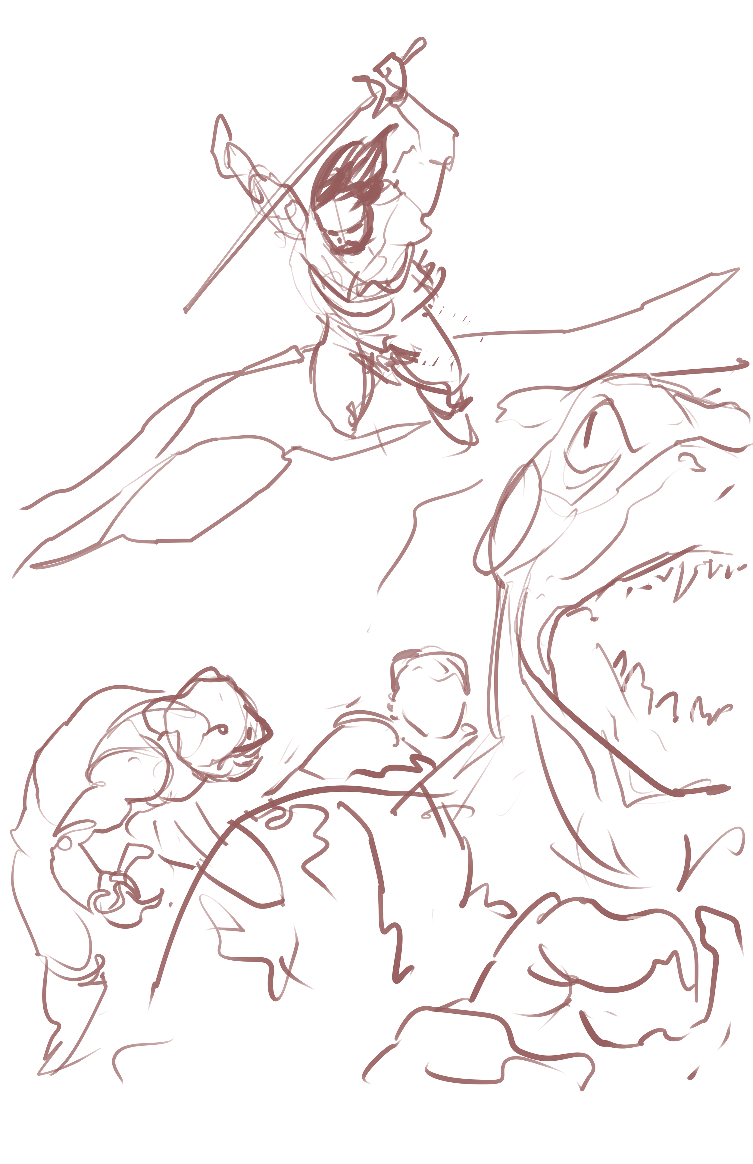
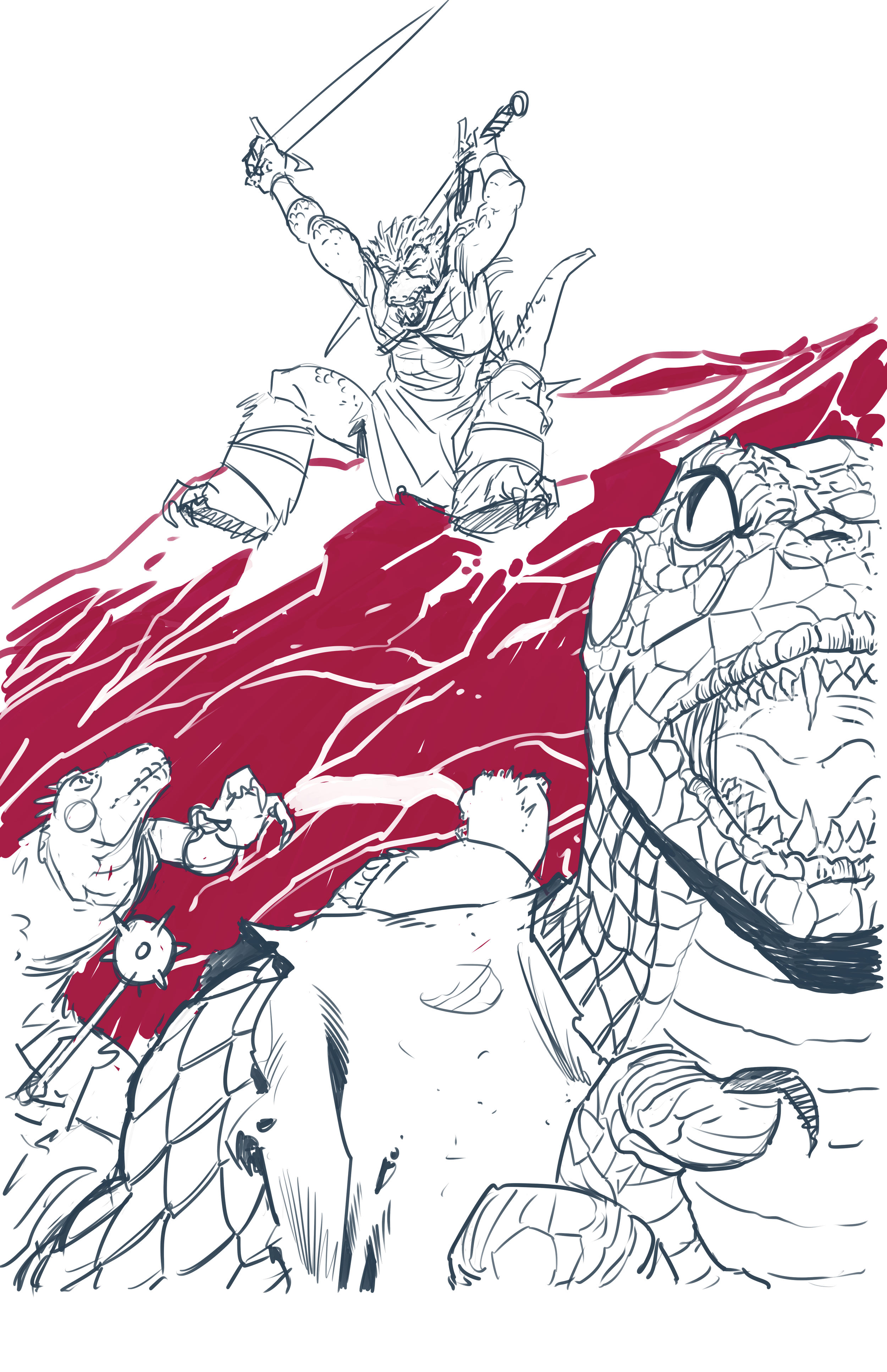
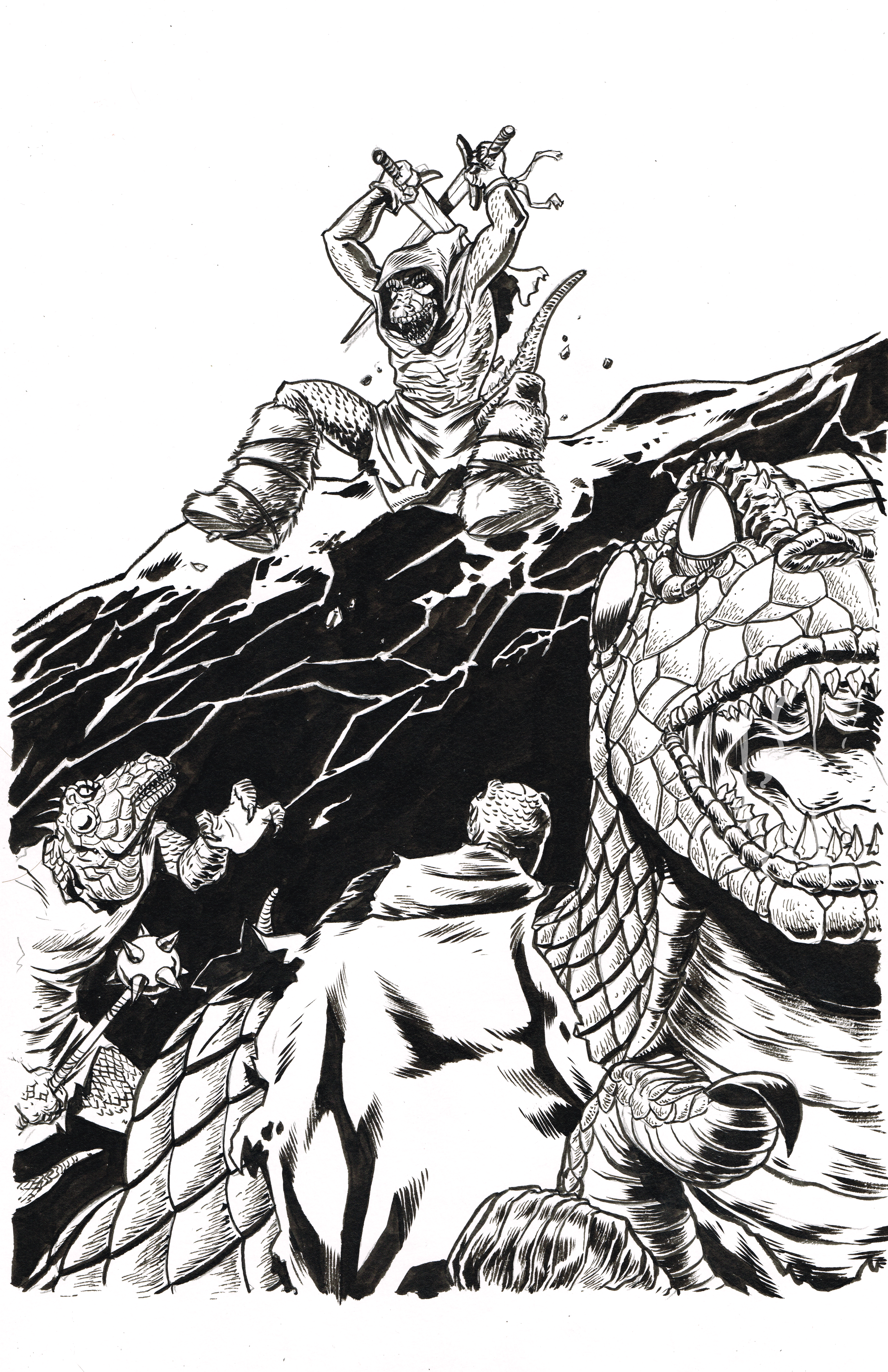
I generally do layouts or pencils digitally and then print them out at size. Depending on how clean I went, I’ll sometimes just print the pencils lightly on the page and ink or paint right over it. Other times (probably most of the time), I’ll flip it and print the roughs on the back of the page and lightbox it so I can see it through the paper and ink that way. I also tend to do ink and watercolor (or ink wash) on just about everything.
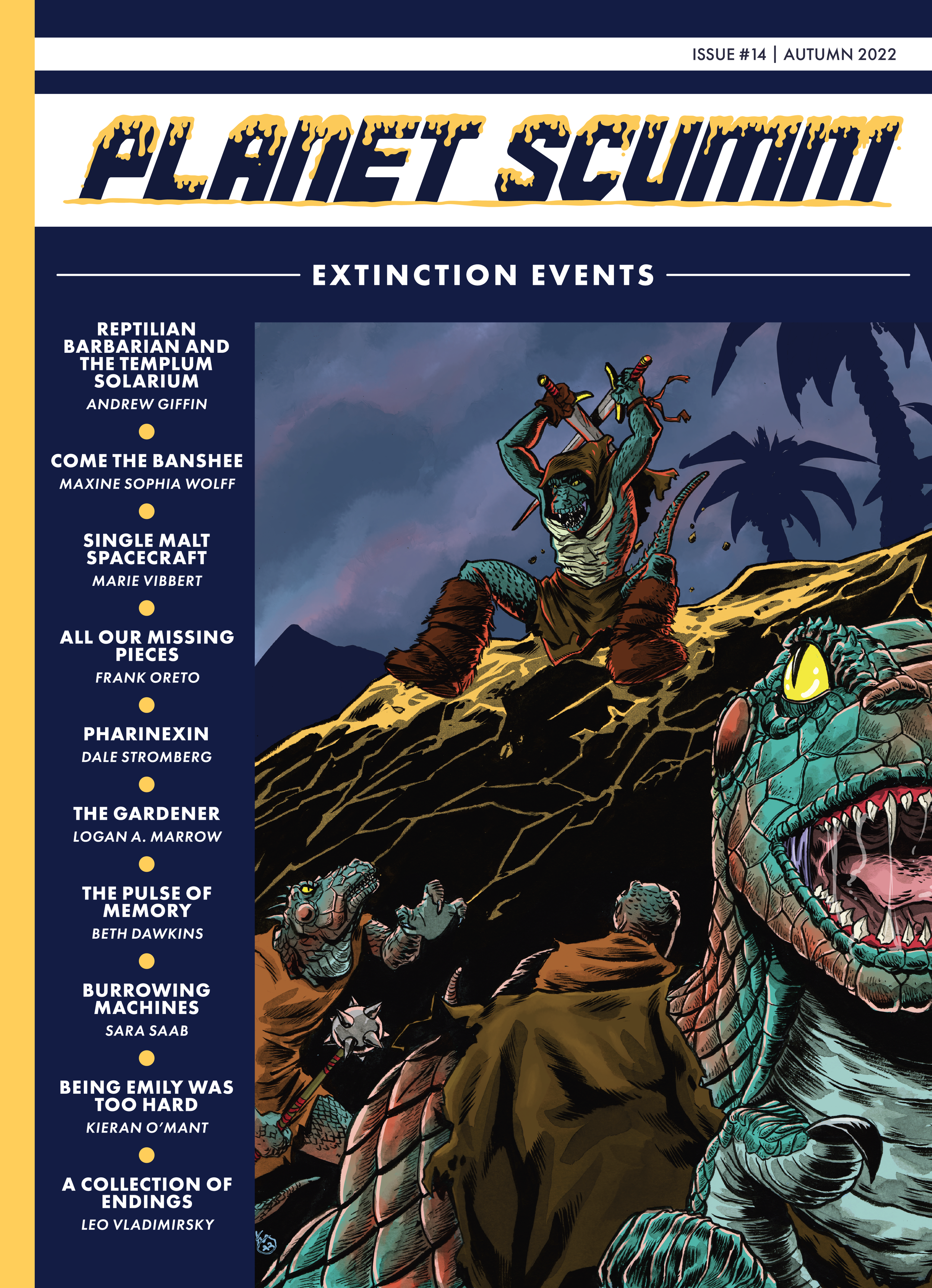
I’ll sometimes color digitally but I’m not quite as good at adapting my overall coloring style to digital. Which is fine. I color differently when I do digital, and I like how it works when I do it. It’s generally pretty simple. This one I did for Scumm is a good example of using a little of everything. I penciled digitally, printed and lightboxed it to ink, added gray washes, scanned it and then colored it digitally.
PS: Where else can Scumm fans find you? Is there anything you’re working on now that we can pick up or keep an eye out for?
KW: I’m working on a few new projects at the moment. The most recent new things out in the wild though are The Life and Death of the Brave Captain Suave: Issue 1, which is out from Scout Comics, Yard Gang is coming out from Storm King, and the Razorblades hardcover collection from Image comics has a story I drew. Those are the most recent things, not including covers and yadda yadda. I stay pretty busy for the most part.
You can find more from Kelly online:
on Twitter at @treebeerd
on Instagram at @treebeerdy
Website (updated about once a year...) at treebeerdstuff.com.


